 DISPENSE
Brutalist interiors for independent pharmacies, compounding labs, and chains tired of looking like fluorescent-lit insurance processing centers.
From diagnosis
to monument.
The origin story of Dispense, told through the spaces we rejected and the ones we built to replace them.
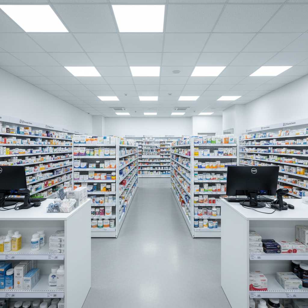
DROP
CEILINGS
DROP CEILINGS
The first thing we tear out.
Suspended acoustic tile: the universal signal that no one cared.
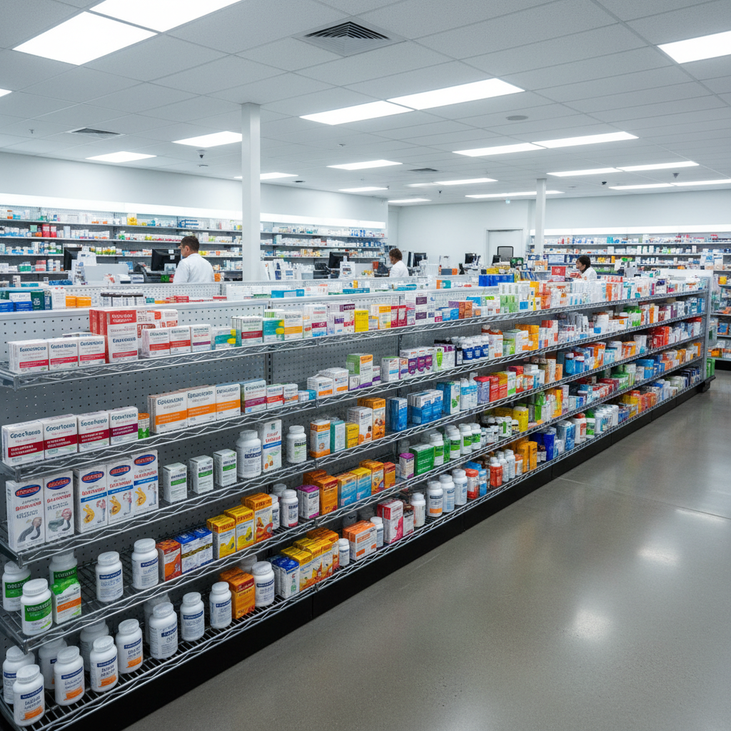
WIRE
SHELVING
WIRE SHELVING
Storage logic borrowed from a warehouse.
of patients judge a pharmacy's clinical competence by its interior before speaking to a pharmacist.
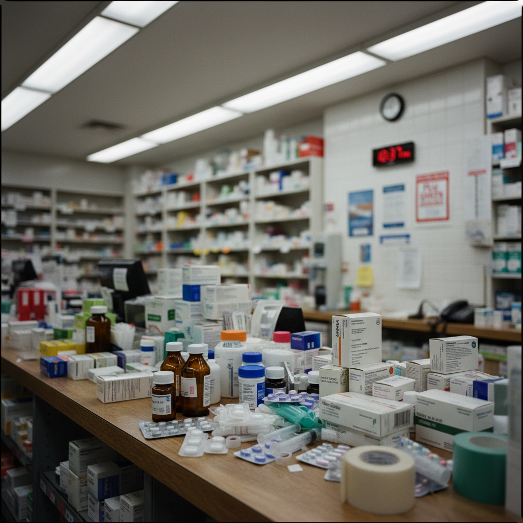
TRUST
DEFICIT
TRUST DEFICIT
The environment undermines the expertise.
When the space looks like a gas station convenience store, the prescription feels like a guess.
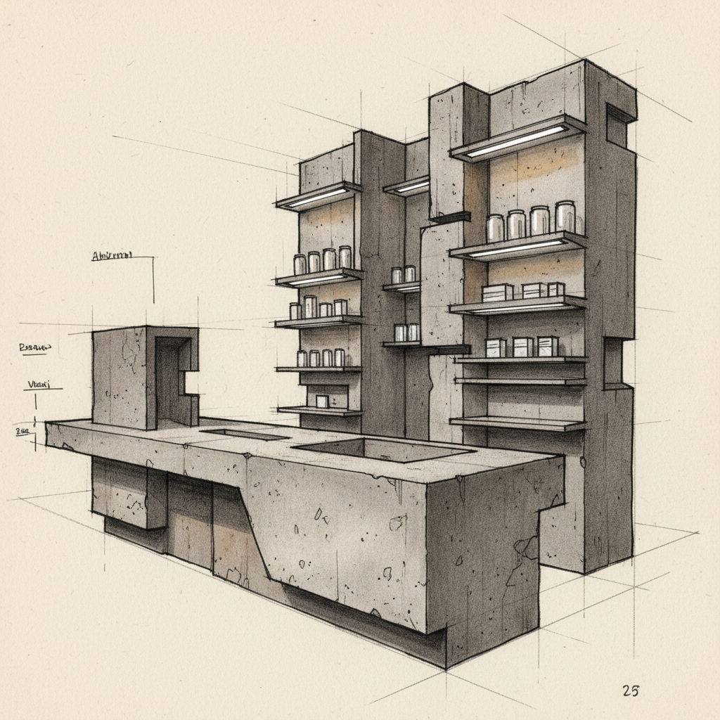
First Sketch
Poured concrete counter, 2021.
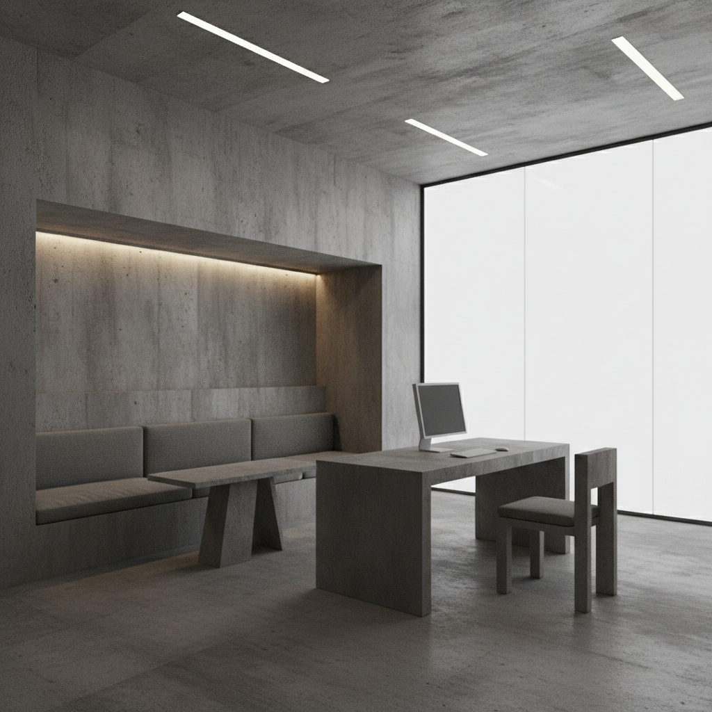
The founding principle: every surface should feel like it was built to last a century.
Average Dispense buildout from demolition to opening.
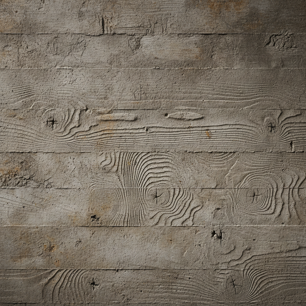
Shutter-Marked Concrete
Every counter bears the memory of its formwork.
We source shuttering boards for grain, not smoothness. The marks are the message.
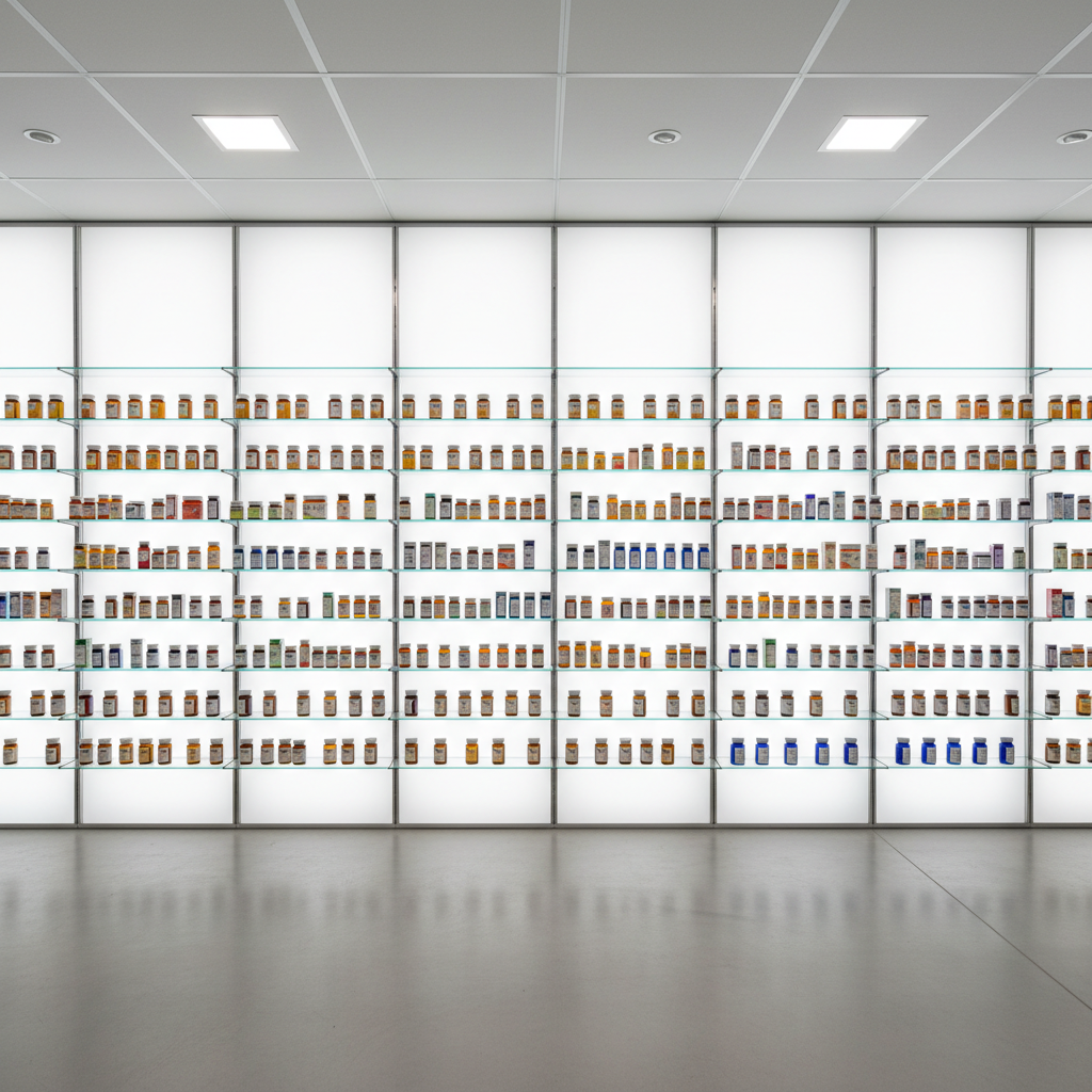
Backlit Pill Wall
The dispensary becomes the display.
Frosted tempered glass backlit at 3200K. Every prescription bottle becomes a specimen.
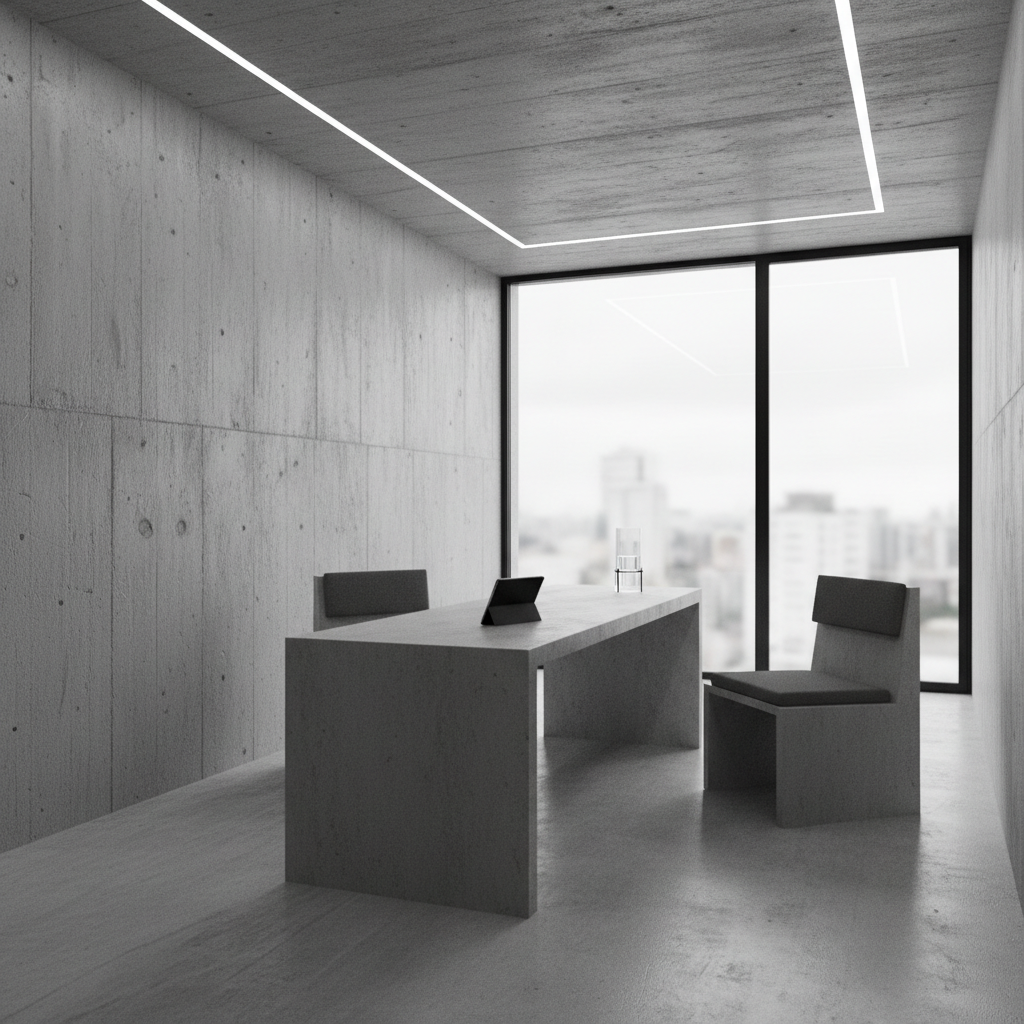
Consultation Bunker
Privacy as architecture.
Recessed consultation rooms with 8-inch concrete walls. The patient feels protected, not processed.
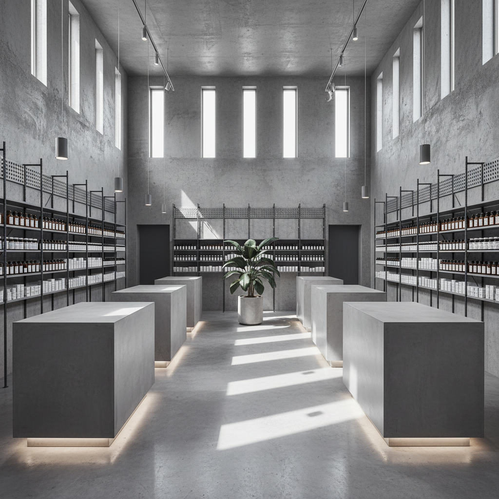
Meridian Compounding
Portland, OR — 2,400 sq ft
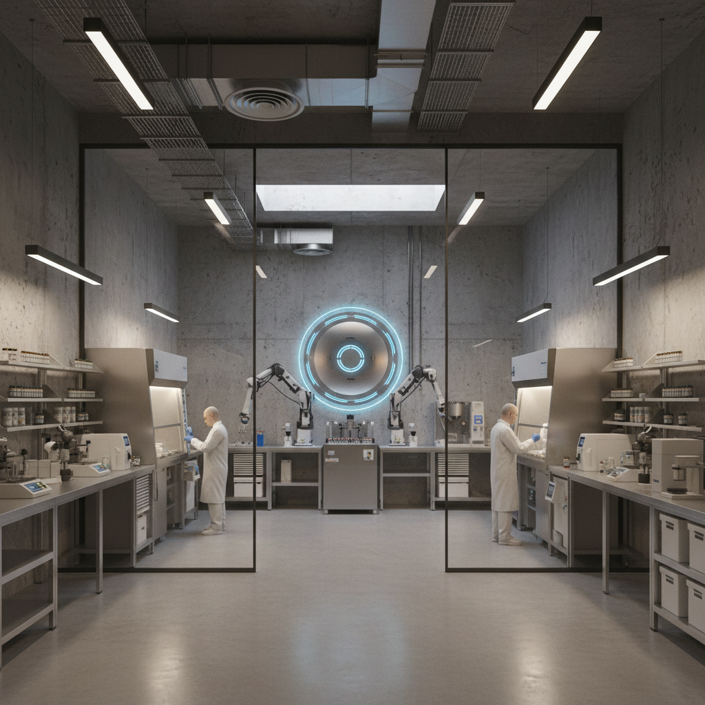
A compounding pharmacy that looks like a research laboratory designed by a sculptor. Poured concrete throughout. Lab visible from the dispensary.
Meridian's compounding revenue in 18 months post-rebrand.
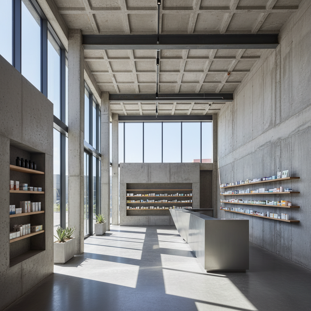
Halcyon Independent
Chicago, IL — 1,800 sq ft
Independent pharmacy in Wicker Park. Steel and concrete. Zero drop ceiling. The neighborhood noticed.
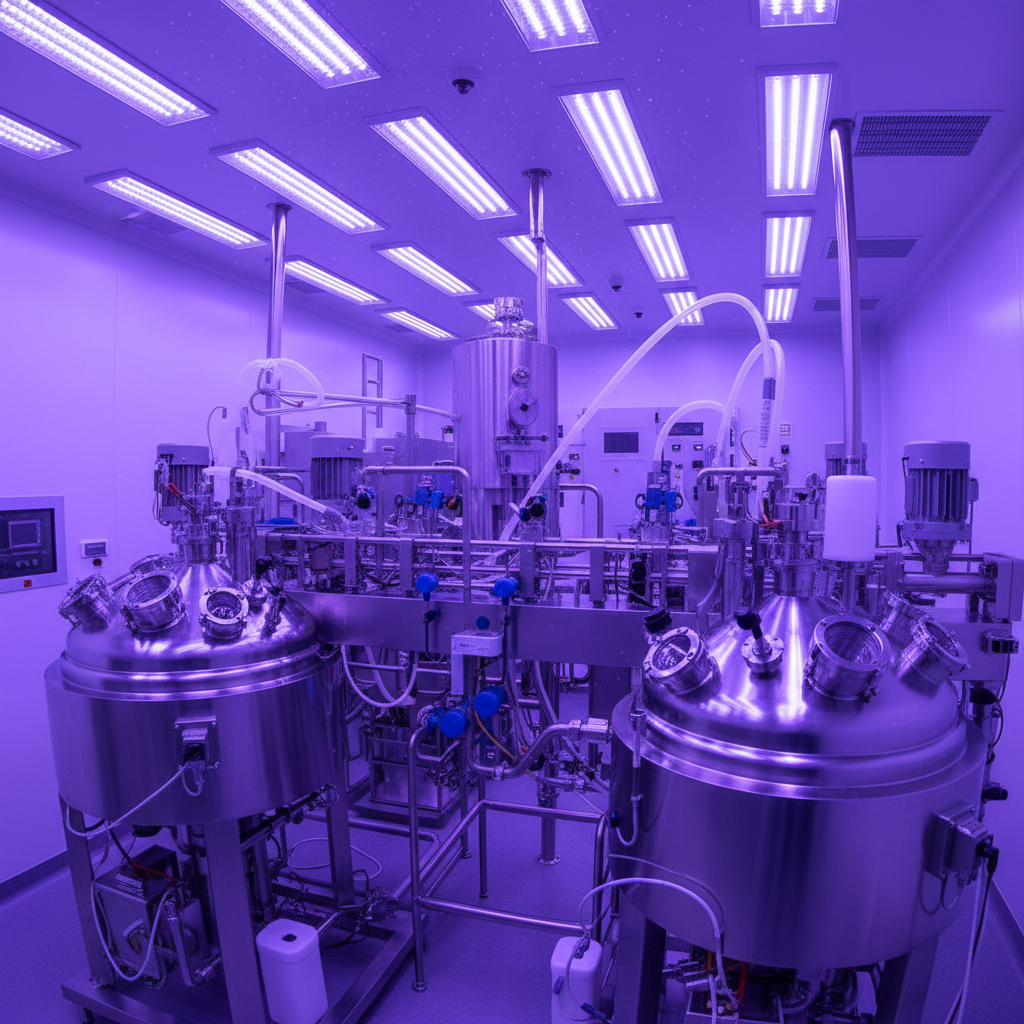
Ultraviolet Sterilization
Function made visible.
UV-C sterilization chambers designed as display objects. Science as aesthetic.
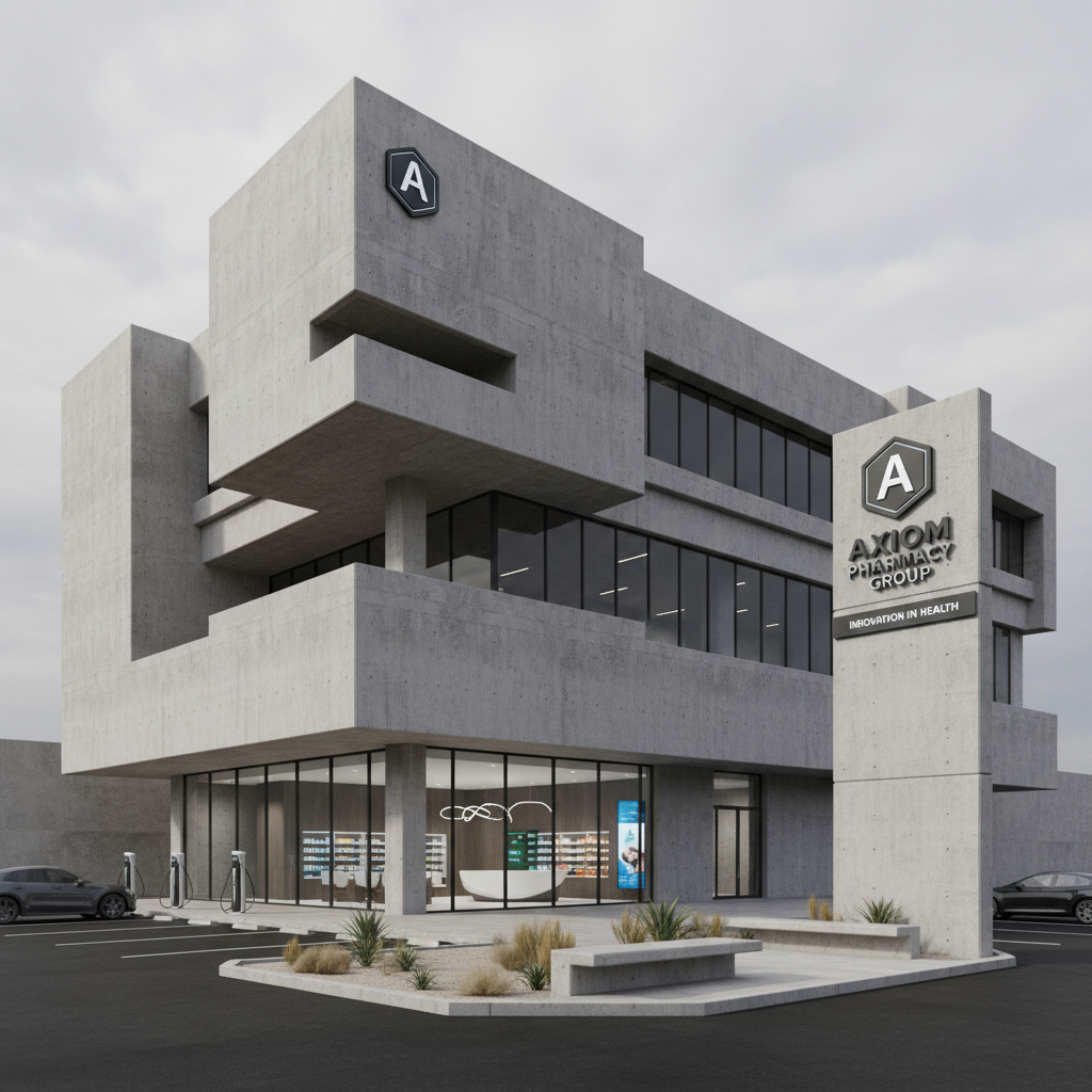
Axiom Pharmacy Group
Austin, TX — 3 locations, 5,200 sq ft total
First chain expansion for Dispense. Each location shares a concrete language but reads the neighborhood differently.
Completed buildouts. Zero fluorescent lighting.
Six weeks. Permanent.
Site Audit
We photograph every drop ceiling, every wire shelf, every fluorescent fixture. Then we document what the space is saying to patients.
Material Selection
Concrete mix, formwork grain, glass specification, lighting temperature. Every surface decision made before demolition begins.
Demolition + Build
Our crew works in parallel: demolition team and build team. Minimal closure. Maximum transformation.
Documentation
Full architectural photography. Every buildout becomes a case study that demonstrates what the space now communicates.
We build for three kinds of pharmacists.
The Independent Owner
Tired of competing on price against chains. Knows their clinical expertise deserves a space that communicates it. Ready to invest in the environment that earns trust before the consultation begins.
The Expanding Chain
Opening new locations and refusing to replicate the generic chain aesthetic. Wants each location to feel locally rooted while maintaining a consistent material language.
The Compounding Pharmacist
Craft-focused. Science-driven. Wants the lab visible from the dispensary. Wants the interior to signal that what happens here is precise, deliberate, and worth the premium.
Compounding
Buildout Division.
We are opening a dedicated practice focused exclusively on compounding pharmacy buildouts. Twelve slots available for 2026. The science deserves the architecture.
Reserve Your Buildout Slot
12 slots · 2026 buildouts · Compounding pharmacies only
The Pharmacy Design Manifesto
28 pages. Our complete argument for why independent pharmacies deserve architecture that matches their clinical ambition.
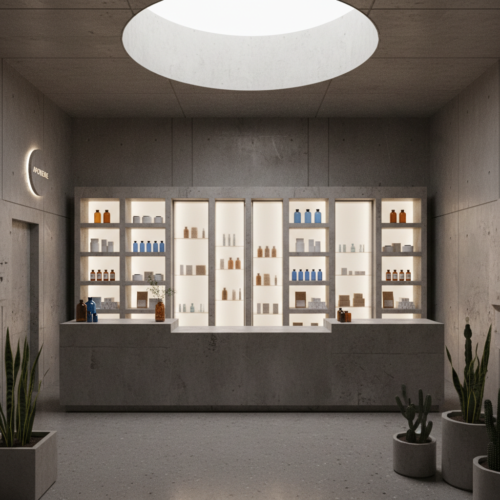
“A pharmacy that looks like a storage facility tells the patient everything they need to know about how their prescription will be filled: efficiently, anonymously, and without care for the craft.”
— Page 4, The Pharmacy Design Manifesto